Sunday, 8 May 2016
Saturday, 7 May 2016
Final Website
To create the website I decided that it'd be best to use Wix as I knew a little about the site prior to using it. It's a very simple but effective tool to use when creating a website due to it's massive range of templates for all kinds of genres and themes. I went for something which gave off a sort of indie pop vibe and decided to go from there.
As you can see it was a little too dark for my liking and so the first thing I decided to change was the background image, this was to hopefully give the whole page a lift of light so that it didn't look so grungy. A long with this I played around with a couple of the tabs and moved them around a bit to reposition everything and make it fit better. I had a play around with some of the colours on the page but decided to just keep green highlights as I thought they were really vibrant against the background and so therefore picking out details to highlight was simple yet effective. I then customised the tour dates and album art so that it was more relevant to our artists.
As you can see in the end our site came out very nicely and gives off a very pop genre vibe. Obviously we could've gone with a lot more colour but, as stated before, when I played with the colours it just didn't look right to our genre. A long with this home page I went ahead and created a bio page, a media page and a contact page so that fans can easily access content and contact the artists if they want them to perform at their venue etc.
Music Video on Twitter
With the use of Twitter our artists were able to upload the music video there, this allows fans to view the video quickly, and then have the option of retweeting/liking it to share it with their friends.
Album Poster
This is our final version of the poster advertising the digipak. Using our poster research we found out the codes and conventions and decided to follow these closely in order to create a successful poster in order to get sales on our digipak. We decided to use a very similar style to our digipak in order to show that they are part of the same product. We made sure to add in the links to the social media pages so that fans are able to easily follow them for updates and news about upcoming tours/album releases. We also included a preview of the digipak so that when people see it on iTunes or in stores they can look at it and recognise the cover which then should make them buy it. We also decided to include two of the songs on the poster "blank space" and "shake it off", this means if fans have heard these songs they will be able to expect more similar songs from the album. We put the text "available now" in contrast with the colour on her jumper in order to make it stand out on the poster, this lets them know that they can go and buy it straight away.
Final Digipak
This is our final digipak that was created in Photoshop. Using our research of current existing digipaks we were able to easily identify codes and conventions like for example, the barcode, the tracklist and the record label.
Friday, 6 May 2016
Our Record Label
We decided to use the image of a brain on our logo as it works in correlation with the word 'mind'. We thought that using an image in our logo would let it be a lot more memorable as opposed to just the words; it is also conventional to use an image in your logo. Through researching other companies logos we were able to find out that it's typical to include the word "record" or "records" in your label name, knowing this we followed this convention as it allows us to create a successful label. We chose this particular font as we thought it looked professional and that's what message we wanted our company to give out.
Thursday, 5 May 2016
Video Construction
Monday 11th April 2016
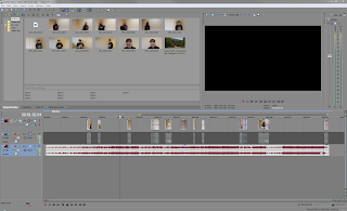
To begin with the video we first transferred all our videos to the computer and placed them into Sony Vegas Pro which is the software we'll be using to edit this video. The first thing we went through was syncing up all of the lip syncing shots so that we'd know what room we had to play with afterwards. This took a fair bit of time but we decided it was key to get the lip syncing down as then we wouldn't have to work on it later on.
Tuesday 12th April 2016
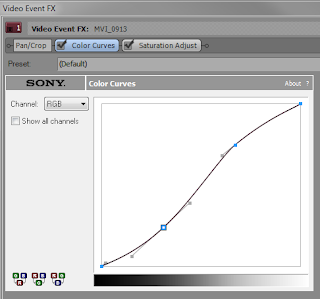
Today we added in a large portion of the footage as we had a lot of spare time. Doing this let us get a general overview of what our video will turn out like, this was beneficial as we were able to chop and change shots where we see fit. We also played around with colour curves and the saturation of the shots to fix where it was too dark or too bright.
Wednesday 13th April 2016
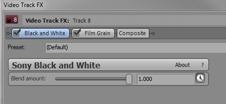
Today we had a bit of a rejig with the footage in order to make it tell the story better, this is because when we looked over what we had done already we decided that it was a bit all over the place in terms of the story and this clearly isn't what we wanted our video to do. We also decided it would be good if we made the entire video desaturated as it's supposed to convey a sad message which black and white does well at.
Monday 18th April 2016
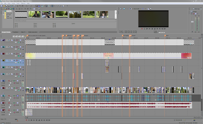
Today whilst editing the video we realised we were beginning to start lacking on footage, we decided it would be beneficial to make some of the footage last longer in the video and so just added bits onto the end of certain parts. This helped and added on 15 seconds of extra video which is quite a big chunk of time considering the length of the overall video.
Thursday 21st April 2016
Today we had unfortunately ran out of original footage for our video and so required more in order to complete the video. Knowing this we planned out times in order to shoot more and therefore finish the video. Overall this was just a minor blip and could've clearly been a lot worse had we ran out of footage the day before the deadline.
Friday 29th April 2016
Twitter Page
We decided to create a Twitter profile for our artists as we know that it is one of the most efficient ways of getting an audience due to it's interactibility with fans. Using this social media we are able to update fans on what the artists are getting up to on a daily basis with photos or videos. It's also a very useful tool as we are able to make use of hashtags trends where users will also be able to see our profile and tweets and take a look at the page if it appeals to them.
https://twitter.com/BlaylockLucy
https://twitter.com/BlaylockLucy
Facebook Page
Using Facebook we were able to easily promote the artists by adding new photos or videos and even dates for tours and/or album releases, such as the release of their new Digipak as seen as the header. A long with this I added to the event section dates for upcoming tours/gigs so that fans can book tickets easily. After this I connected the Facebook page to our website and Twitter page so that fans can keep up to date by following all forms of social media. With the use of Facebook our artists were able to simply grow their fan base through communication with the fans, we also knew that our target audience would be using social media such as Facebook and Twitter and so this makes it much simpler to connect with them.
https://www.facebook.com/Lucy-Blaylock-and-Danny-Reginatto-1089017987835215/timeline
Filming Diary
Filming diaries
1.
For our first filming session we mainly were practicing for when we start properly filming. We kept all our filming in our sixth form common room after school so it wasn't too busy.
We filmed the two actors laughing and sitting together, we are hoping this will be for the beginning of the video where we show the actors as being friends before the dynamics change, we had the actors talking and laughing in the sixth form common room, had them walking down a corridor as if they were coming back from a lesson, again laughing and talking together, them we had them walking out the door but the male actor holding the door open for the female actor, we are hoping to contrast this with a later shot of the male actor walking straight out of the door and shutting it on her.
2.
For our second filming session we mainly practiced lip-syncing for certain parts of our video. We wanted to see what the actor’s skill level was for lip-syncing before we started to film.
We filmed the actors in front of a white background; we gave them a few lines to lip sync and tried out lots of different ways to make it as realistic as we could. We tried them singing the lines to make it more like they are actually singing it. This method worked well and we are hoping to use it when we start properly filming our lip-syncing parts.
3.
For our third filming session we had a few lip-syncing parts for our female actress. We did all our filming in front of a white wall for this particular part.
We filmed her lip-syncing to a few lines of the song, we chose these lines as they are the more important lines and we felt having her sing them in the video would put more emphasis on the lines.
We experimented with lots of different angles and positions to find ones that worked well in that particular shot and I think we did this well.
4.
For our forth filming session we had a few lip syncing and solo acting parts for our male actor. We did all our filming in a quiet area where there was not much disturbance.
We filmed him lip-syncing to a few lines of the song, we chose these lines as they are the more important lines
and we felt having him sing them in the video would put more emphasis on the lines.
We experimented with lots of different angles and positions to find ones that worked well in that particular shot and I think we did this well.
5.
For our fifth filming session we had a few parts where our male actor was sitting outside. We did all our filming on a road close to us where he was walking alone.
We filmed him walking outside alone as this part would be put right at the end of the video where they had gone their separate ways.
We experimented with lots of different angles and positions to find ones that worked well in that particular shot and I think we did this well.
6.
For our sixth filming session we had a few parts where both our male and female actors were sitting and walking outside. We did all our filming on a road close to us where they were walking both together and alone.
We filmed them walking outside alone as this part would be put right at the end of the video where they had gone their separate ways.
However we also filmed them together as this part would be put nearer the beginning of the video.
We experimented with lots of different angles and positions to find ones that worked well in that particular shot and i think we did this well.
Before and After photos
To create the album cover we mainly used photoshop due to a wide range and variety of features that are able to be used when designing and creating. A long with this we used a website (http://vectormagic.com) which allows you to automatically turn images into high quality vectors, the reason we did this is so that our cover will have a unique look to it as opposed to the same, generic covers artists make.
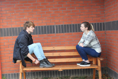
Before:
After:
As you can see the images now look slightly cartoonish which we thought came out well in the cover and poster and added something different to our production.

Before:
After:
As you can see the images now look slightly cartoonish which we thought came out well in the cover and poster and added something different to our production.
Wednesday, 4 May 2016
Initial Ideas
Boy and girl – like each other, flirty
Story:
Like each other, one moves on because don’t get asked out.
Locations:
Park
Streets
House
Actors/actresses:
Lucy
Danny
Props:
Guitar
Phones
Costume:
Casual
Makeup:
Natural
Storyline:
Walking down street together, close ups
Messing about in shops
Have them at one house watching film
Girl texting other guy
Guy sees this, gets angry, throws phone
Awkward occurrences
Leave note to the other.
Why:
Song is about change in a relationship whether that be romantic or
otherwise, we have chosen to have two friends that like each other, but neither
wants to ask the other out, and the change will be when the girl moves on and
starts texting another guy, and this leads to them stopping contact altogether.
Prop List
Phone:
We decided to use a phone
because in our story to show that the girl had moved on from the boy we decided
to show her texting him instead of showing him physically there as we believed
this would leave it more for the audience to interpret instead of showing them
exactly what was happening.
Guitar:
We decided to use a guitar
because we wanted to show the how much the boy likes the girl by showing him
writing a song for her, although he never plays it for her, he will write it
for her. This would show how the boy likes the girl but is too scared/shy to
tell her.
Actor Profiles
Name: Danny Ovens
Date of birth: 16th
February 1998
Place of birth: Epsom,
England
Nationality: British
Height: 5' 9"
Education: Attended Epsom
and Ewell high school
Contact number:
07527593584
Email: dannyovens@gmail.co.uk
Twitter: @Danovensacting
Name: Lucy Percell
Date of birth: 30th June
1996
Place of birth: Epsom,
England
Nationality: British
Height: 5'6"
Education: Attended Epsom
and Ewell high school
Contact number:
07097483326
Email: lucypercell1@gmail.co.uk
Twitter: @Lucypercell
Subscribe to:
Comments (Atom)


